- test
Adobe Analytics - Workspace Tips & Tricks
Hi there, fellow Adobe user. As you may know, Adobe Analytics offers a wide range of possibilities; there are numerous options in the workspace alone. But some of them are a bit hidden or harder to find, that's why I created this blog post.

Click on each tip below to get more information. I will add a new tip or trick every time I discover something new or interesting!
Adapting the colours in your workspace
Re-ordering dimensions in a workspace table
Combining segments in your workspace
Creating a segment dropdown in your workspace
Checking linked visualisations of a table
Changing workspace labels
Hiding tables
Wrap your header text
1. Adapting the colours in your workspace
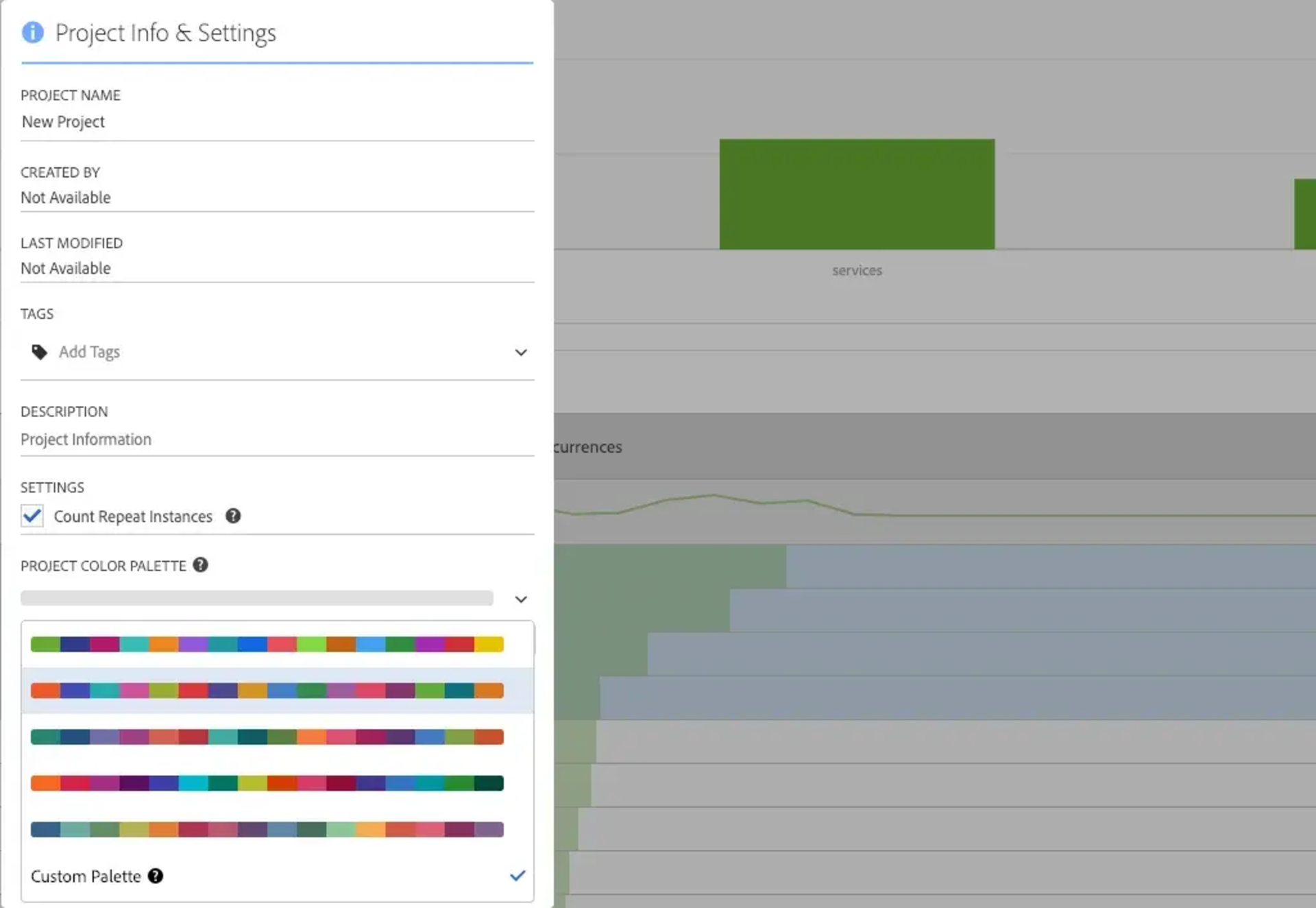
Recently Adobe made it possible to adapt the colours in the workspace. This changes the look and feel of the workspace and allows you to adapt the workspace to suit your preference, brand colours or company colours.
You can choose between a range of pre-defined colours, or even configure your own set of colours, using comma-separated hex values. The order of the colours plays an important role as well: the first color is the most important one and will be the first color used in graphs and in the tables themselves. The second color will be the 2nd used color in the visualisations, and so on.
Try to keep in mind that colours following each other need to differ enough in order to have clear visualizations.
You can change the colours in your workspace by going to "project > Project Info & Settings" in the top left corner of your workspace, and select Project Color Palette at the bottom.
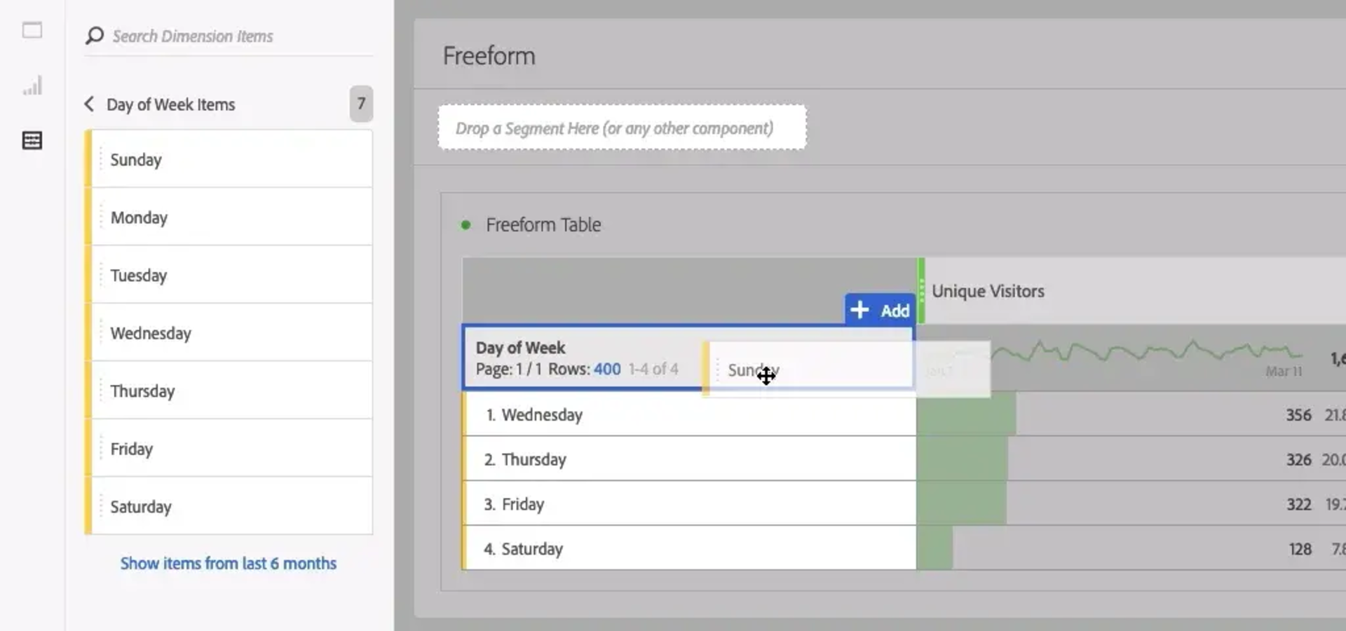
2. Ordering dimensions or rows in a workspace table
Sometimes you might want to change the order of a dimension in your workspace table. No problem! There are 2 options to do this.
Option 1: Choose the order
Let's say you made a graph of Days of Week, but you would like it to start on Monday, instead of Sunday (which is the default start of week day in Adobe). You can work around this by dragging and dropping each dimension separately, allowing you to determine its order. This can be done by clicking on the little arrow next to your dimension in your search panel. The first value you drag will remain the first one shown.
It is possible to permanantly change the start day of week in Adobe as well! You can change this in the Report Suite Manager (Admin > Report Suites) under "General > Customize Calendar". If you don't have Admin rights you can ask one of the administrators to change this. Any day is possible to select (you can even select a different month as first month of the year).
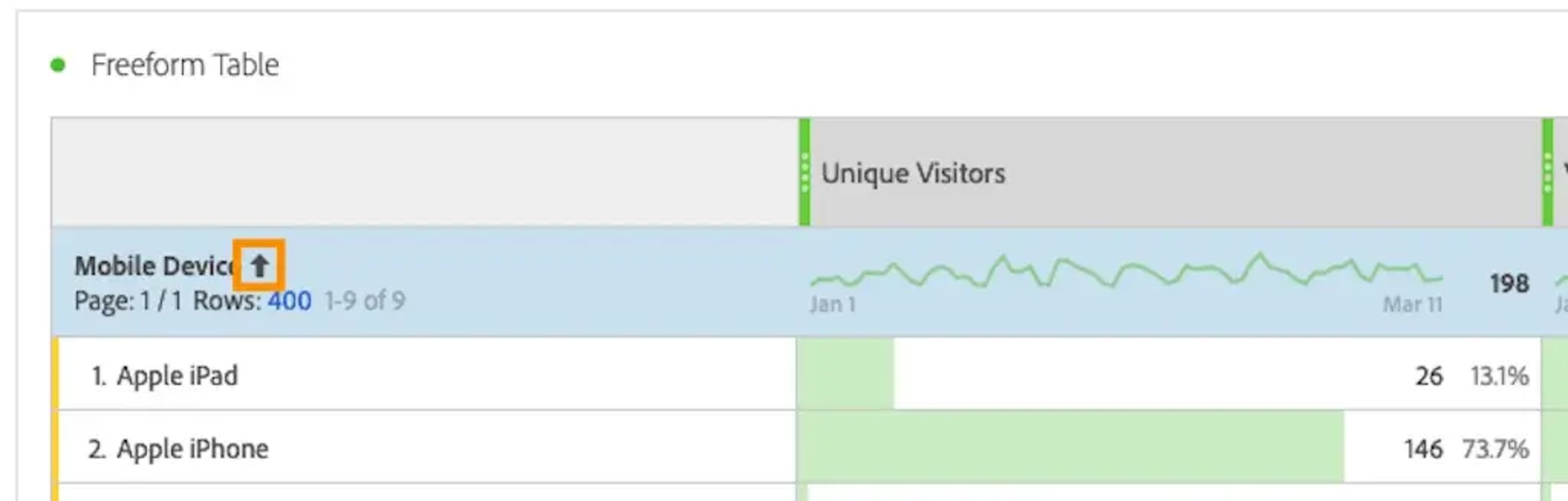
Option 2: Order alphabetically
Another handy trick to help you order your dimension alphabetically exists as well. Simply select all the rows you would want to see (even selecting every value works just fine), right click, and select "display only selected rows". After doing this, you will notice an arrow appearing next to your dimension name, allowing you to order the dimension. Off course, this only gives you the option to order from A-Z or from Z-A, which would not make much sense in the previous example, but might come in handy in other cases.
3. Combining segments in your workspace
You can simply add multiple segments in your workspace by dragging them on top of each other. Adobe will automatically only consider hits, sessions or visitors that meet all segments included. For example, if you drag a segment "only male" and another one "25y and older" on top of that, your workspace will only contain information from males that are 25 or older. There is no need to create a separate segment for this.
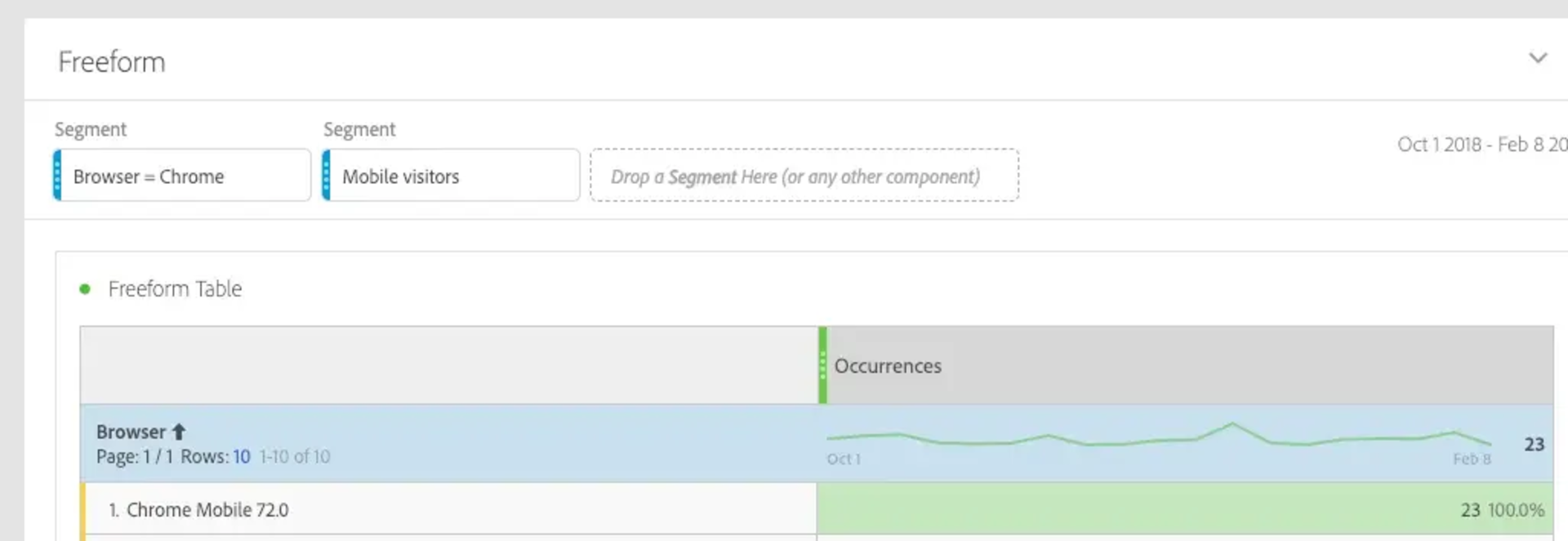
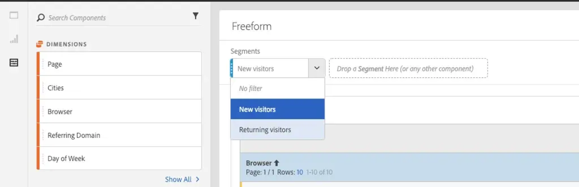
4. Creating a segment dropdown in the workspace
Another segmentation tip: you can drag multiple segments on top of your workspace, and show them as a drop down.
This allows you to quickly switch between segments, within the same workspace. This can be done by holding the 'Shift' button when dragging a second segment into the workspace. Segments are not combined as would be the case when you drag and drop them without holding the shift key, but you can quickly shift between them.
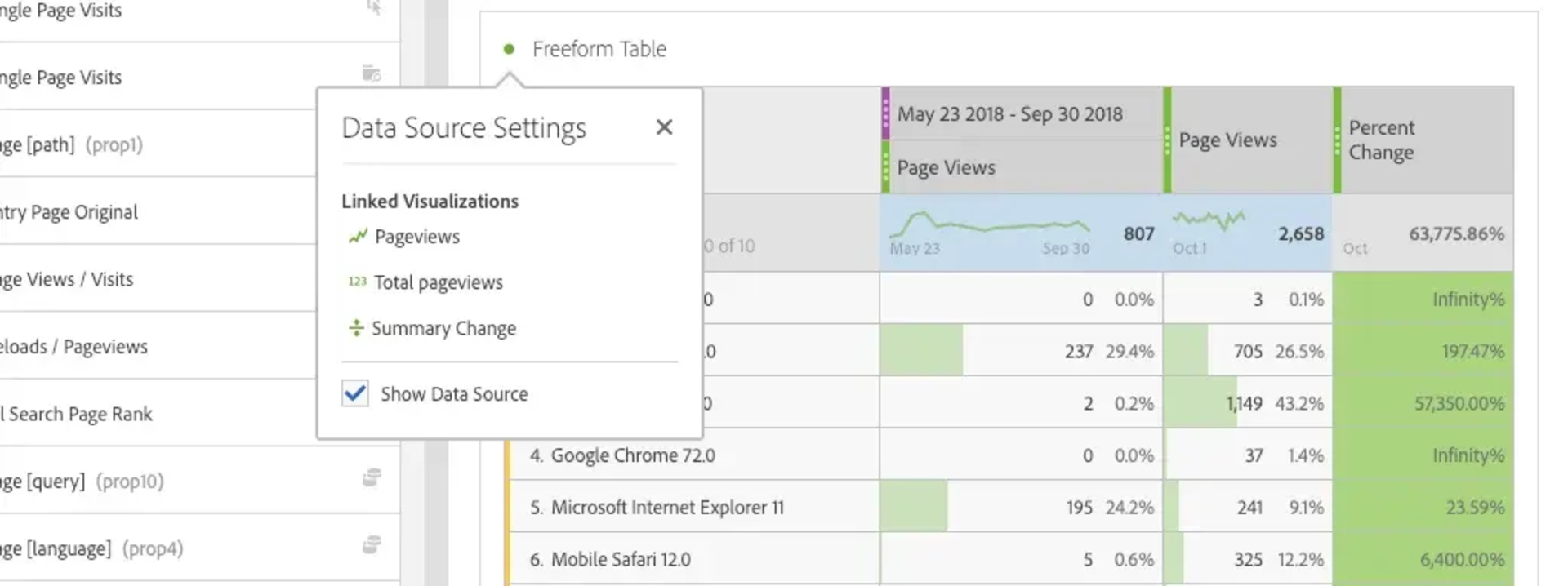
5. Linked visualisations
Not sure if deleting a table would result in some lost visualisations? You can easily check this by clicking on the small dot in the top left corner of a table. A list of the linked visualisations, with their names and type of visualisation is shown.
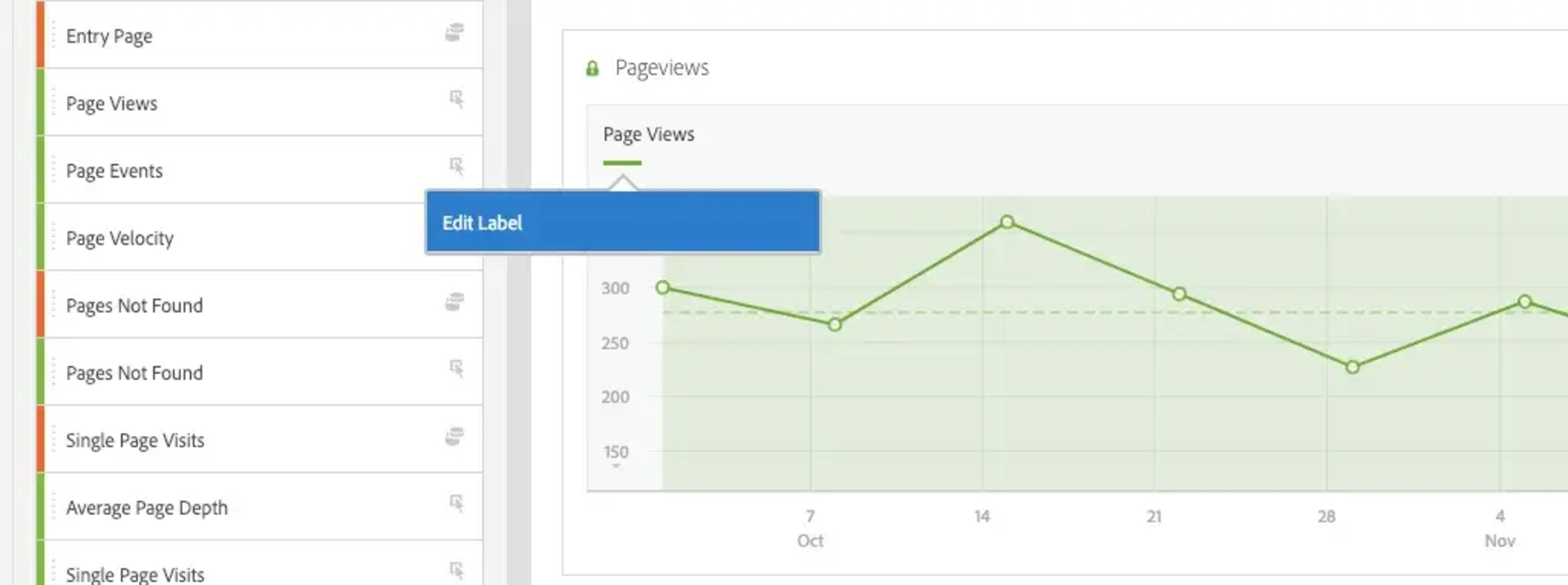
6. Changing workspace labels
Labels of metrics and dimensions are not always straightforward, you might want to change the labels inside your workspace before sharing, so that users can understand your workspace more easily. This can quickly be done by clicking right on the label you want to change, and type what you would like to see. Don't be afraid, this will not change the actual name of the dimension or metric you are adapting, but only the label shown in your workspace.
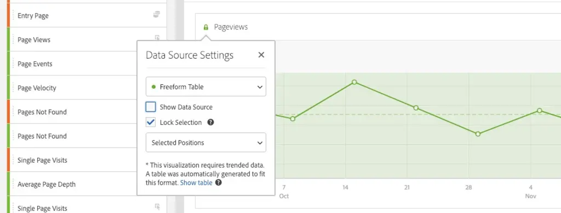
7. Hiding tables
Did you know it is super easy to hide tables? Sometimes you just want to see a visualization without the table with data behind it. You can easily hide the table by clicking on the little dot in the top left corner of the graph and unselecting "Show Data Source". This keeps your workspaces tidy and clear.
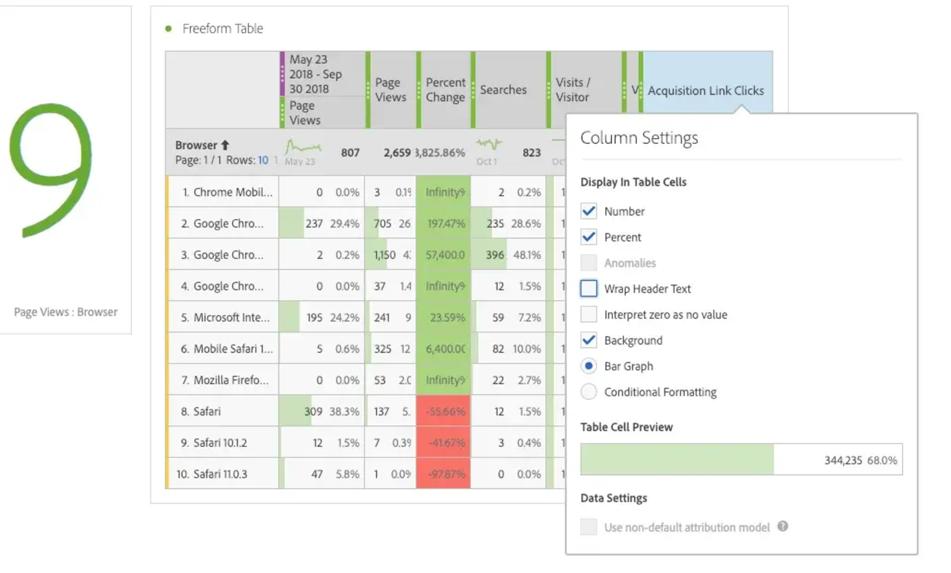
8. Wrap header text
Adobe now has the option to wrap your header text. In the past, when combining many metrics, you often had the issue of seeing only half of the label. Thanks to the new wrap option, header text is wrapped and better readable. Just click on the gear icon in the column and click "wrap header text". By default, this will be selected, but you can deselect it as well, avoiding a very wide top bar when having a long name.
These are my tips for now, but be sure to check in regularly, I will add more tips&tricks when I bump into something interesting. When I have some more complicated subjects to discuss, you can find them in separate blog posts.